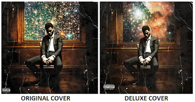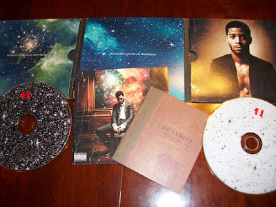
The second studio album by Kid Cudi is a sequel to his first in the “Man on the Moon” series titled “The End of Day” which over 100,000 copies in it’s first week and charted at #4 last year. This is the deluxe edition of the rapper’s “Man on the Moon II: The Legend Of Mr. Rager” which I bought just yesterday when it came out, I usually buy music from iTunes but for I thought I’d buy the Digipak as it can be used to analyse for my media coursework. The cover artwork features him sitting in a Victorian style room, solemnly deep in thought, holding a glass possibly containing Brandy or Whisky which connotes the idea of expensive alcohol is popular with celebrities with such lifestyles. The cover has a faded sepia tint, while the paper looks very creased, the detailing on walls of the room all adds to the 1800s old-fashioned look. The whole package is astronomy themed, in relation to the title of the album “Man On The Moon” implying the idea that he is out of this world; an extraordinary artist. There is a window/painting behind him showing an amazing starry space-like view; interstellar clouds are visible which have become very popular recently, possibly because of this album. The nebula makes the viewer feel relaxed and chilled out, reflecting how Cudi believes his music does, with his original chilled-out slow paced beats. The fold out pack is fairly simple, it features two more images of nebulae with small capitalised and centered text: “my music is one small step for me; one giant leap for all weirdkind” which shows how he believes he is on a different level to everyone else, higher than anyone. “Weirdkind” is American slang for someone who is a leader, and not a follower so this implies that he sees himself as the leader of leaders. He is wearing a clean cut suit which reflects his well-known reputation of being a stylish and an intelligent hip-hop artist, but his top button is undone which suggests he is more laid back. The pack includes lyric booklet with calligraphic fonts, so fans can enjoy singing along; the font is relevant because it suits the Victorian era of the cover and his costume.

The free poster included with the album is an imitation of Leonardo Da Vinci's famous world-renowned drawing of the 1400s, "The Virtuvian Man" which is based on the human proportions. Kid Cudi may want to relate himself to the work of a famous artist, as he sees wants the audience to see him as a great icon. He also has biblical references with a yellow glow around his head, almost like a halo. Other images of featured artists on the album are also seen within the circle, such as Kanye West, Common, MGMT, and Ratatat. The poster almost looks like a planet, again emphasising that he is out of this world; a great artist, with no other like himself, and the effect on the poster makes it look like a neon painting/sketch which is very interesting to look at.
This is a cover of a metropolitan hipster men's lifestyle magazine which is promoting Kid Cudi's album, which I thought was relevant to include in this section because of the main "out of space" concept being overused to promote Cudi's uniqueness. It is a very interesting cover, as Complex Magazine always uses such images to attract the audience's attention. The image has a surreal theme, and it seems as though Cudi is peeling open the cover to reveal himself and his own world. Constellations and nebulae can be seen from behind the page which is the overall theme of his albums; this is very appealing to the audience because of the rising popularity of these images via the internet (blogging sites, etc.) This cover, poster and CD digipak all have a similar theme and Cudi has created a house style out of it, which concludes the fact that his products must have some type of relation for it to be attractive and appealing to the public.


No comments:
Post a Comment