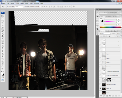
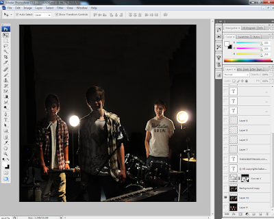
This photo is too dark, because it is backlit and the low flash setting so I had to adjust the lighting and make tonal corrections. I wanted to keep the dark background because I believe it looks professional, and brings out the figures more but if I just used the "Brightness/Contrast" adjustment, I would lose a lot of the black background and will get a low quality light grey/green shadow. There is a new feature in Photoshop that will allow me to get my desired effect.
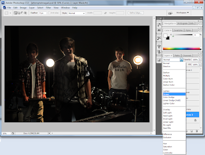
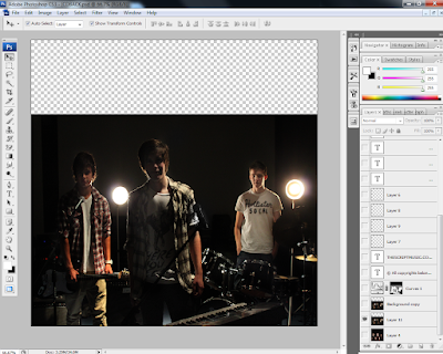
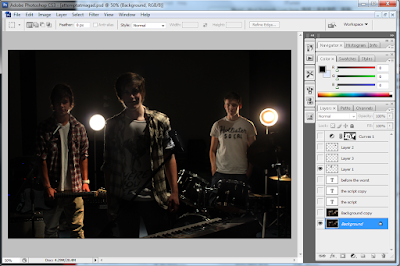 To do so, I have created a new Curves Adjustment layer, which I didn't not adjust the levels on. By clicking on the effect of the layer, I selected "screen" which brightens the whole image, and changed the opacity to 75% as it was a bit too bright. By pressing the "Ctrl" and "I" keys, I created an invert of the screened layer, which allow me to paint the sections I wanted brighter, for example the faces of the members of the band and some instruments.
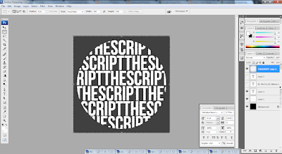 After creating the outline, I added the titles of the tracks on the album using the text tool again, making sure it covered the whole circle. I changed the opacity and fill of the layer, to make it light and used the "soft light" setting to create a more subtle enhancement of the object. I also smoothed the font to make it look more soft, because the "sharp" and "crisp" setting were too jagged.
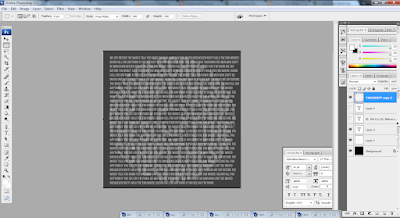
Using the same selection tool I had saved before, I re-selected and inverted the area, while hiding the text layers. After the selection had been refined, I click on the text layer and rasterized it so I could delete the edges around it. De-selecting the area, I can now see a silhouette of my text, with more text making up the whole word. I believe this CD would look more professional if it was simple like this, instead of an image of the band, as the rest of the digipak already features enough pictures and also, the cut out of the middle hole in the CD may ruin the photo, so I opted with just plain and simple text effects for the Compact Disc design.

No comments:
Post a Comment