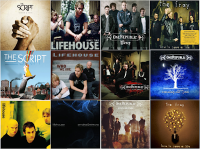
Looking through similar artists' CD covers, I have gathered that the rock-pop genre use relatively simple album artwork. It is common to have a full band shot with just the title of the band similar to a poster, it is also not rare for artists not to be on the front at all either. Simple symbols and meaningful artwork can also be the selling point of a CD.

Another factor I have also noticed is the style of font used on the covers; it must be simple, and easy to read. The band "One Republic" have a designed logo which they use on all their covers, with a border and simple swirls to make the cover look more appealing. Other bands simply use capitalised letters with a simple bold font, so I have downloaded a few fonts and tested out which font I will be using. "Hand of Sean" is a font I am familiar with, because I've used it before but I wanted to try other fonts including some "MS Script" fonts, which I feel is portraying the title of the band in a way, using handwritten characters to show the band's name. I like "Halo Handletter" because of the neat lines, I feel this may add to the band's appeal as the audience will feel as though the album has been signed by the band, as if they've written it their selves.


No comments:
Post a Comment