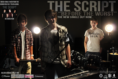
This photo is too dark, because it is backlit and the low flash setting so I had to adjust the lighting and make tonal corrections. I wanted to keep the dark background because I believe it looks professional, and brings out the figures more but if I just used the "Brightness/Contrast" adjustment, I would lose a lot of the black background and will get a low quality light grey/green shadow. There is a new feature in Photoshop that will allow me to get my desired effect.
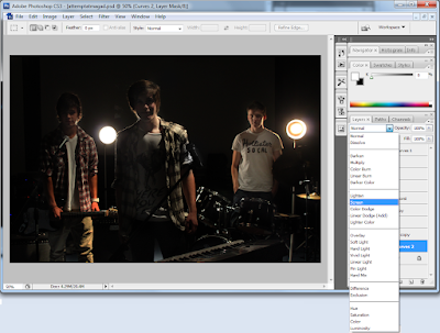
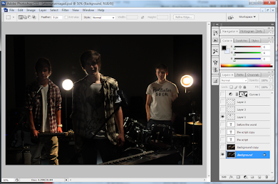 To do so, I have created a new Curves Adjustment layer, which I didn't not adjust the levels on. By clicking on the effect of the layer, I selected "screen" which brightens the whole image, and changed the opacity to 75% as it was a bit too bright. By pressing the "Ctrl" and "I" keys, I created an invert of the screened layer, which allow me to paint the sections I wanted brighter, for example the faces of the members of the band and some instruments.
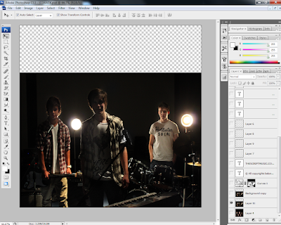
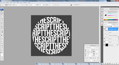 After creating the outline, I added the titles of the tracks on the album using the text tool again, making sure it covered the whole circle. I changed the opacity and fill of the layer, to make it light and used the "soft light" setting to create a more subtle enhancement of the object. I also smoothed the font to make it look more soft, because the "sharp" and "crisp" setting were too jagged.
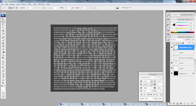
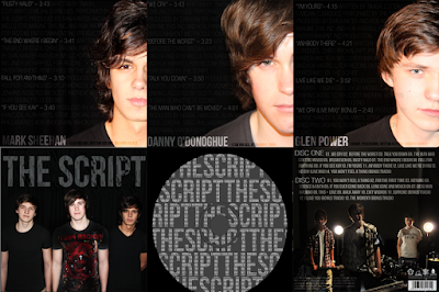
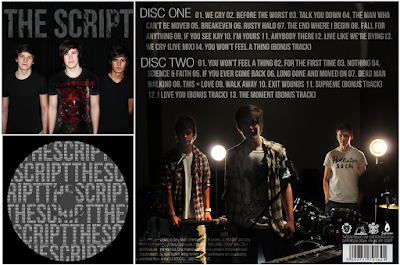
Using the same selection tool I had saved before, I re-selected and inverted the area, while hiding the text layers. After the selection had been refined, I click on the text layer and rasterized it so I could delete the edges around it. De-selecting the area, I can now see a silhouette of my text, with more text making up the whole word. I believe this CD would look more professional if it was simple like this, instead of an image of the band, as the rest of the digipak already features enough pictures and also, the cut out of the middle hole in the CD may ruin the photo, so I opted with just plain and simple text effects for the Compact Disc design.
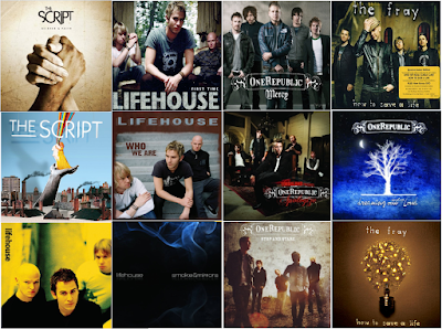
Looking through similar artists' CD covers, I have gathered that the rock-pop genre use relatively simple album artwork. It is common to have a full band shot with just the title of the band similar to a poster, it is also not rare for artists not to be on the front at all either. Simple symbols and meaningful artwork can also be the selling point of a CD.

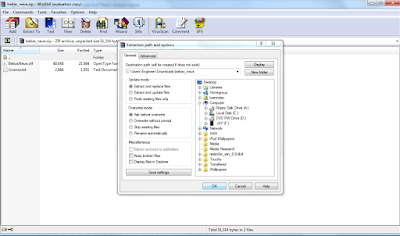
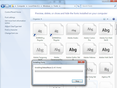
Another factor I have also noticed is the style of font used on the covers; it must be simple, and easy to read. The band "One Republic" have a designed logo which they use on all their covers, with a border and simple swirls to make the cover look more appealing. Other bands simply use capitalised letters with a simple bold font, so I have downloaded a few fonts and tested out which font I will be using. "Hand of Sean" is a font I am familiar with, because I've used it before but I wanted to try other fonts including some "MS Script" fonts, which I feel is portraying the title of the band in a way, using handwritten characters to show the band's name. I like "Halo Handletter" because of the neat lines, I feel this may add to the band's appeal as the audience will feel as though the album has been signed by the band, as if they've written it their selves.
My final video has been completed, however I had difficulties with exporting the file into the correct frame size. It was a matter of trial and error, to achieve the best quality while compressing the file size, I had to select "Convert Quicktime conversion, and adjust the settings, changing the frame rate, and I also had to de-interlace source, set 16:9 HD 1280 x 720 H264 codec, 5000kb bitrate, single pass compressor (to save time), and 128kb stereo audio because the fade I have added at the end would not be effective if it was set to 64kb mono audio.
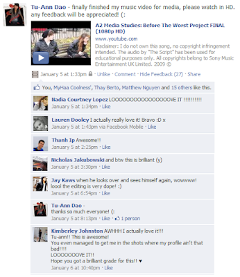
I have posted this video on social networking site, Facebook to gather feedback, and so far I have only received positive feedback, with no criticisms. I will be making a new questionnaire, which will allow anonymous users to comment. It has gathered over six times the amount of likes as the rough cut, which is a good thing I suppose.
