Tu-Ann's Advanced Portfolio
Saturday, 5 March 2011
Wednesday, 2 March 2011
Evaluation
My evaluation is not yet completed but I have uploaded a draft of what I have done so far, because I have had difficulties with filming/recording voiceovers in the media mac room, because the microphone picks up every little noise, so it's hard to record with people in there. I have stayed after school every day but there are always too many people in there to record, so I will keep coming at my free lessons, to check if anyone is up there. Sorry, here is the embed video of the start of my evaluation:
Friday, 24 December 2010
Wednesday, 22 December 2010
Tuesday, 21 December 2010
Ancillary Text Production
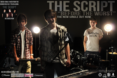
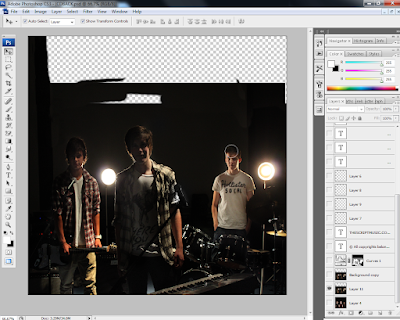
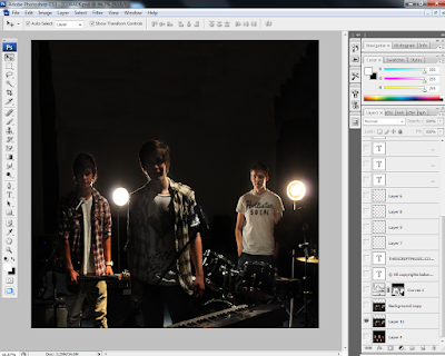
This photo is too dark, because it is backlit and the low flash setting so I had to adjust the lighting and make tonal corrections. I wanted to keep the dark background because I believe it looks professional, and brings out the figures more but if I just used the "Brightness/Contrast" adjustment, I would lose a lot of the black background and will get a low quality light grey/green shadow. There is a new feature in Photoshop that will allow me to get my desired effect.
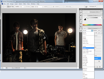
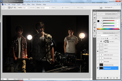 To do so, I have created a new Curves Adjustment layer, which I didn't not adjust the levels on. By clicking on the effect of the layer, I selected "screen" which brightens the whole image, and changed the opacity to 75% as it was a bit too bright. By pressing the "Ctrl" and "I" keys, I created an invert of the screened layer, which allow me to paint the sections I wanted brighter, for example the faces of the members of the band and some instruments.
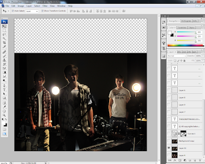
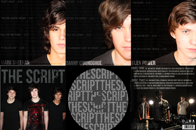
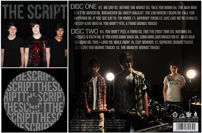
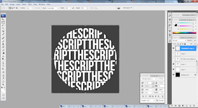 After creating the outline, I added the titles of the tracks on the album using the text tool again, making sure it covered the whole circle. I changed the opacity and fill of the layer, to make it light and used the "soft light" setting to create a more subtle enhancement of the object. I also smoothed the font to make it look more soft, because the "sharp" and "crisp" setting were too jagged.
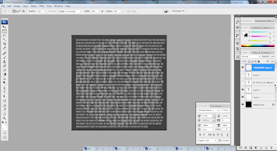
Using the same selection tool I had saved before, I re-selected and inverted the area, while hiding the text layers. After the selection had been refined, I click on the text layer and rasterized it so I could delete the edges around it. De-selecting the area, I can now see a silhouette of my text, with more text making up the whole word. I believe this CD would look more professional if it was simple like this, instead of an image of the band, as the rest of the digipak already features enough pictures and also, the cut out of the middle hole in the CD may ruin the photo, so I opted with just plain and simple text effects for the Compact Disc design.
Monday, 20 December 2010
Post Production: Additional Research
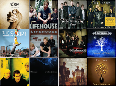
Looking through similar artists' CD covers, I have gathered that the rock-pop genre use relatively simple album artwork. It is common to have a full band shot with just the title of the band similar to a poster, it is also not rare for artists not to be on the front at all either. Simple symbols and meaningful artwork can also be the selling point of a CD.

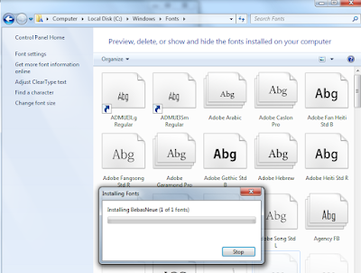
Another factor I have also noticed is the style of font used on the covers; it must be simple, and easy to read. The band "One Republic" have a designed logo which they use on all their covers, with a border and simple swirls to make the cover look more appealing. Other bands simply use capitalised letters with a simple bold font, so I have downloaded a few fonts and tested out which font I will be using. "Hand of Sean" is a font I am familiar with, because I've used it before but I wanted to try other fonts including some "MS Script" fonts, which I feel is portraying the title of the band in a way, using handwritten characters to show the band's name. I like "Halo Handletter" because of the neat lines, I feel this may add to the band's appeal as the audience will feel as though the album has been signed by the band, as if they've written it their selves.
Saturday, 18 December 2010
Final Draft of Music Video
My final video has been completed, however I had difficulties with exporting the file into the correct frame size. It was a matter of trial and error, to achieve the best quality while compressing the file size, I had to select "Convert Quicktime conversion, and adjust the settings, changing the frame rate, and I also had to de-interlace source, set 16:9 HD 1280 x 720 H264 codec, 5000kb bitrate, single pass compressor (to save time), and 128kb stereo audio because the fade I have added at the end would not be effective if it was set to 64kb mono audio.
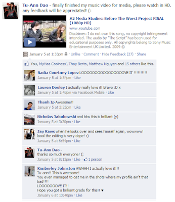
I have posted this video on social networking site, Facebook to gather feedback, and so far I have only received positive feedback, with no criticisms. I will be making a new questionnaire, which will allow anonymous users to comment. It has gathered over six times the amount of likes as the rough cut, which is a good thing I suppose.
Monday, 15 November 2010
Feedback and Analysing Results (Incomplete)
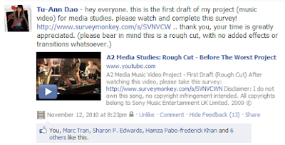
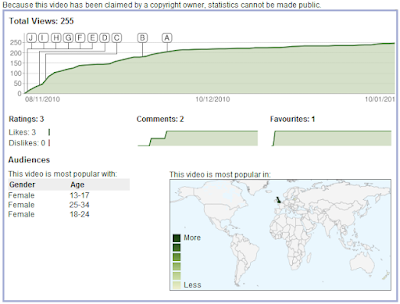
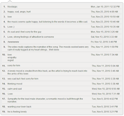
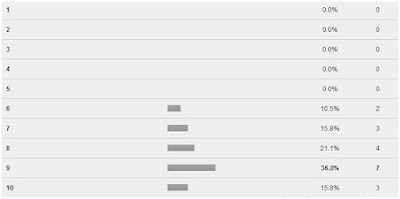
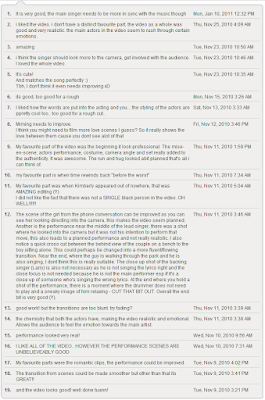
To know which sections to improve on from my first draft, I have gathered a lot of audience feedback, from my teacher as well as my peers. I have posted my rough cut video on popular social networking site, Facebook, which gathered a few "likes" and i have also emailed a lot of my peers the link for my questionnaire which allowed anonymous feedback as I believe people may be more honest if they knew I didn't know who they were. This has been proven to be successful, as I have recieved 85% more feedback than what I would've gotten, without using the anonymous option. This website, Surveymonkey has allowed me to set up a relatively simple questionnaire for my audience to quickly answer, without the need of signing up for an account or subscribing to any newsletters. I have mostly used multiple choice questions so analysing the results would be more convenient, but I have also added an extra text-box for the people who want to elaborate on their answer.
I added personal audience questions at the start of the questionnaire, such as gender and age to gather information on which audience my video is most popular with.


The next question, was about whether or not the audience felt the video fitted the song, featuring less narrative, more performance or vice versa. The results gathered were positive and they felt it featured an equal balance of the two.
 After asking that question, I though it'd be relevant to ask whether or not the performance scene was convincing. A vast majority of the audience believed it to be realistic, but a few suggested the actors needed to be more confident, and needed more practice with the instruments. I feel this is important so I will use better shots of the actors in the theatre.
Tuesday, 9 November 2010
First Draft of Video (Rough Cut)
I have created a questionnaire on Surveymonkey, gathering audience feedback as i can send the link out easily on networking sites and the viewers can more conveniently see the video, rather than printing a lot of sheets and going around the school asking for people's opinions. This is the link for my survey, http://www.surveymonkey.com/s/SVNVCWN i am currently collecting the results, and once enough people have taken the questionnaire, i will publish the feedback. No transitions or effects have been added whatsoever. A few people have mentioned they are confused because there is no establishment between the past and present, so I will be making the flashbacks greyscaled with lowered saturation, coloured hue, a slight Gaussian blur or bloom, and lighter matte/vignette. I have also decided to use superimposing, in my video which means I can get two of the same person in one shot, using my editing skills to make the video look more interesting. A few of the clips are also out of sync, and the quality of the video is not it's best which I will fix carefully in my final draft.
Sunday, 7 November 2010
Behind The Camera
Here are some photographs I have taken while I was out filming my video, the image file sizes were too large to upload so I have compressed the files and made a Graphics Interchange Format (GIF image) slideshow animation on Adobe Image Ready, Photoshop, and Jasc which makes the images easier to view, more convenient in terms of space, and also more presentable rather than clutter of images.
____________________________________________________
Here are some photos of the narrative scenes, which will be edited to give a "flashback" look(lowered saturation, coloured hue, a slight Gaussian blur or bloom, and lighter matte/vignette.)They will portray the happy memories. Locations include Archie's house, Ford Square, Whitechapel Library. (12 images)
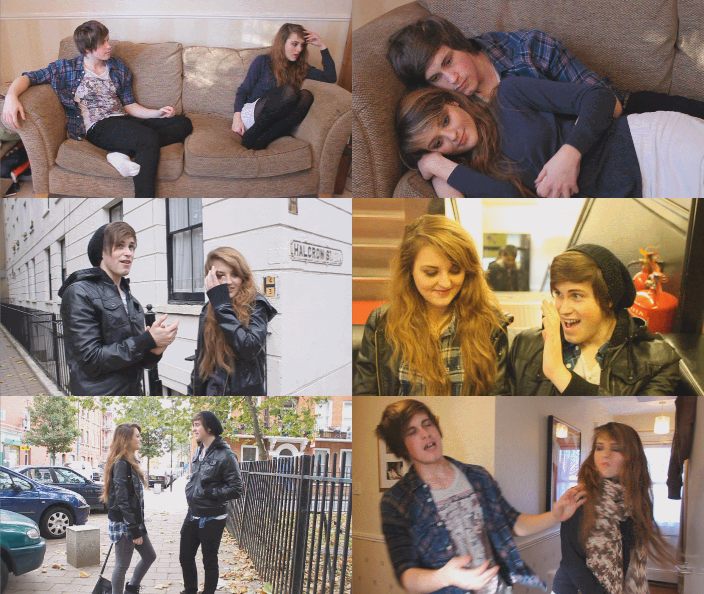
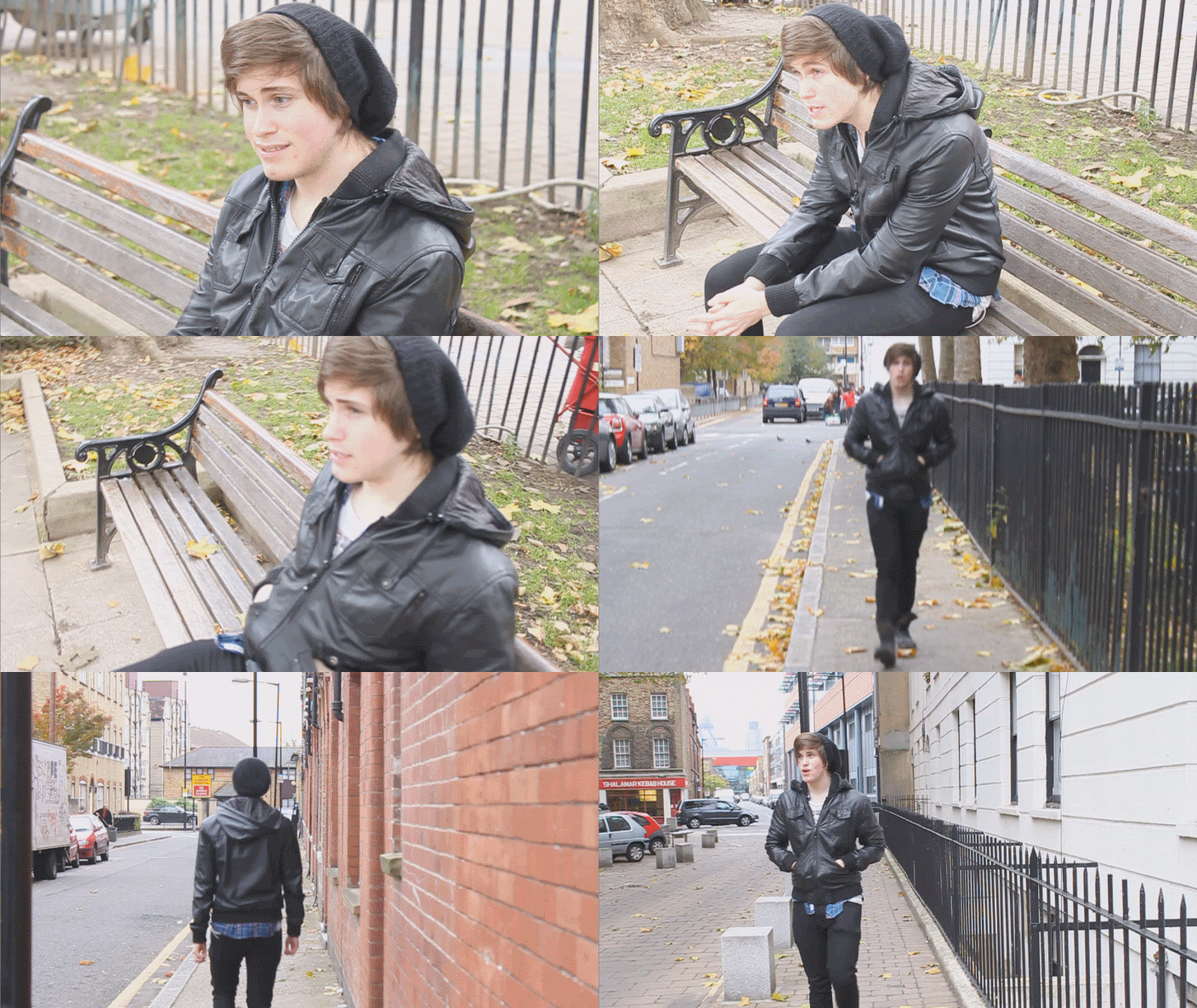
These are some scenes with the male lead, who is walking around the areas that he used to spend with his love interest. He is seen looking miserable and he is in very isolated locations, to emphasise the loneliness in his heart. (I had to film very early in the morning so the roads would be empty). He is sitting at the bench, reminiscing about the memories he had with her, while almost having hallucinations of her coming back. (9 images)
During the performance scene, I used my digital camera to take photos of the band altogether in the drama theatre. I thought the spotlights in the background looked good as they created orbs on the camera which adds to my desired effect.
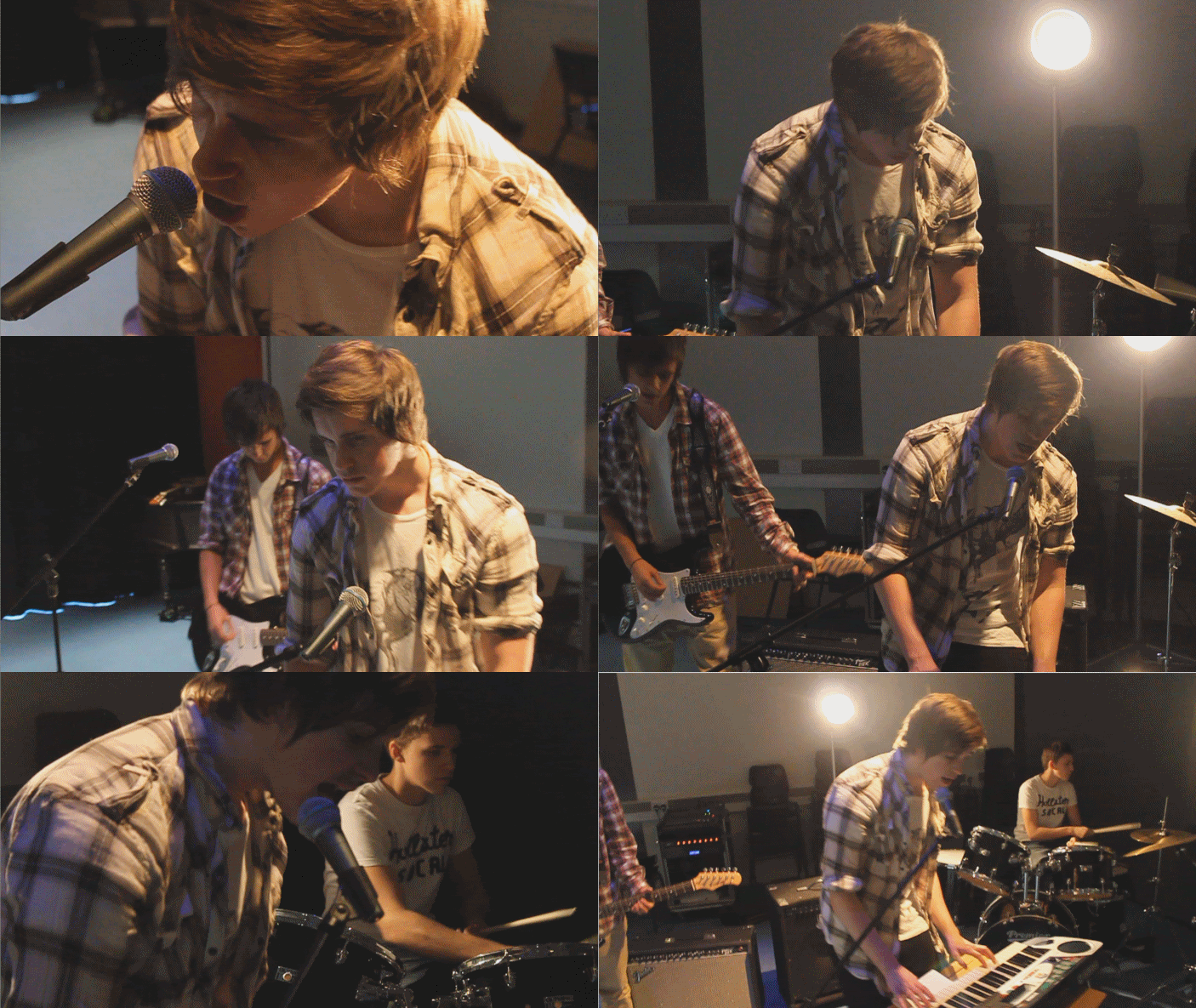
These are the full band shots, featuring two or more members: (9 images)
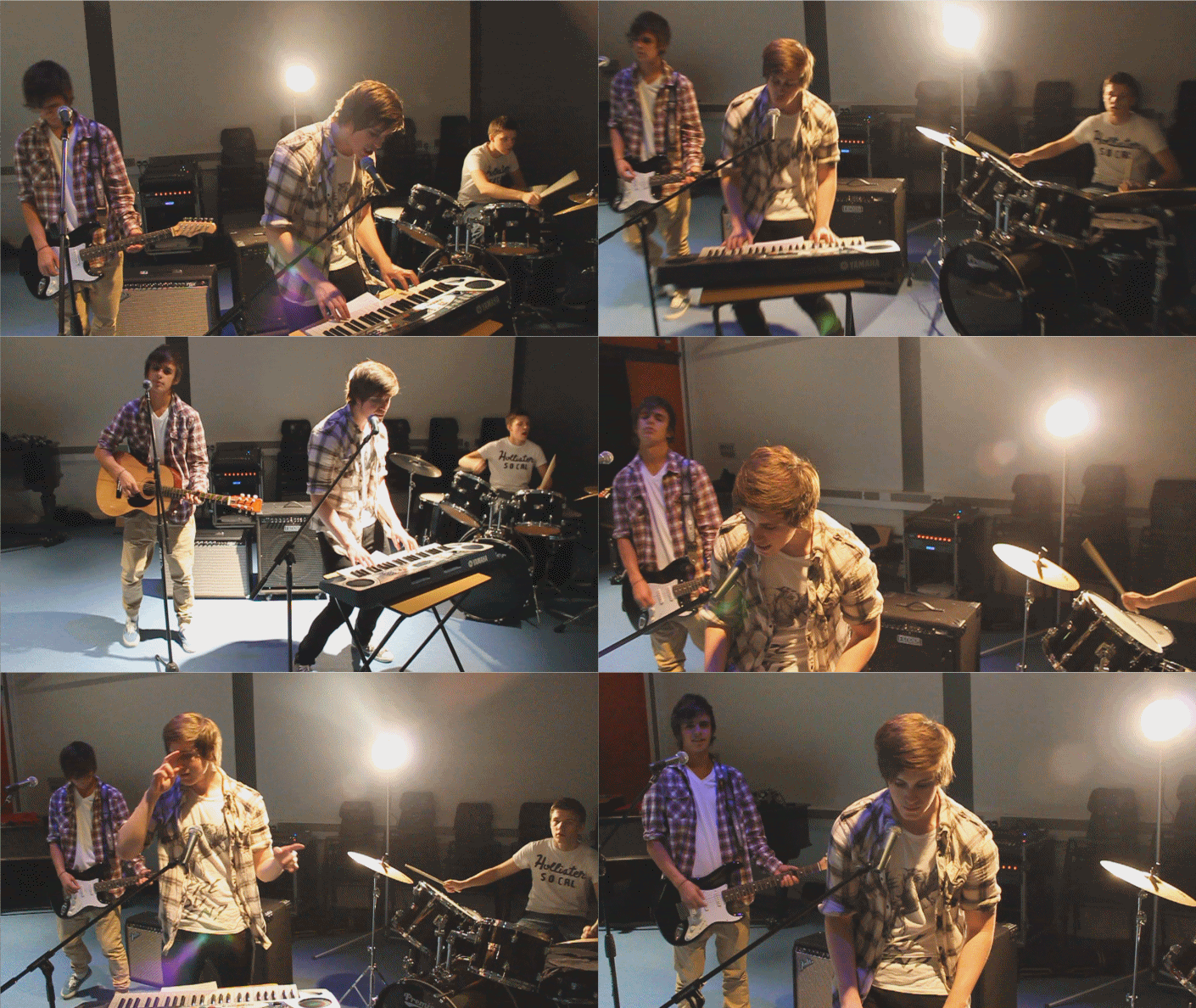
Lead singer Archie playing the digital keyboard: (12 images)
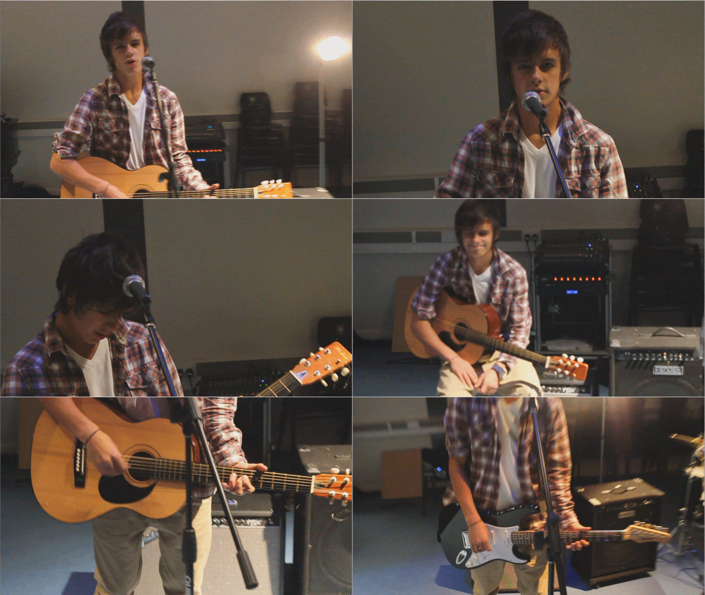
Backup singer Larry on the guitar: (11 images)
Nicholas playing the drums: (9 images)
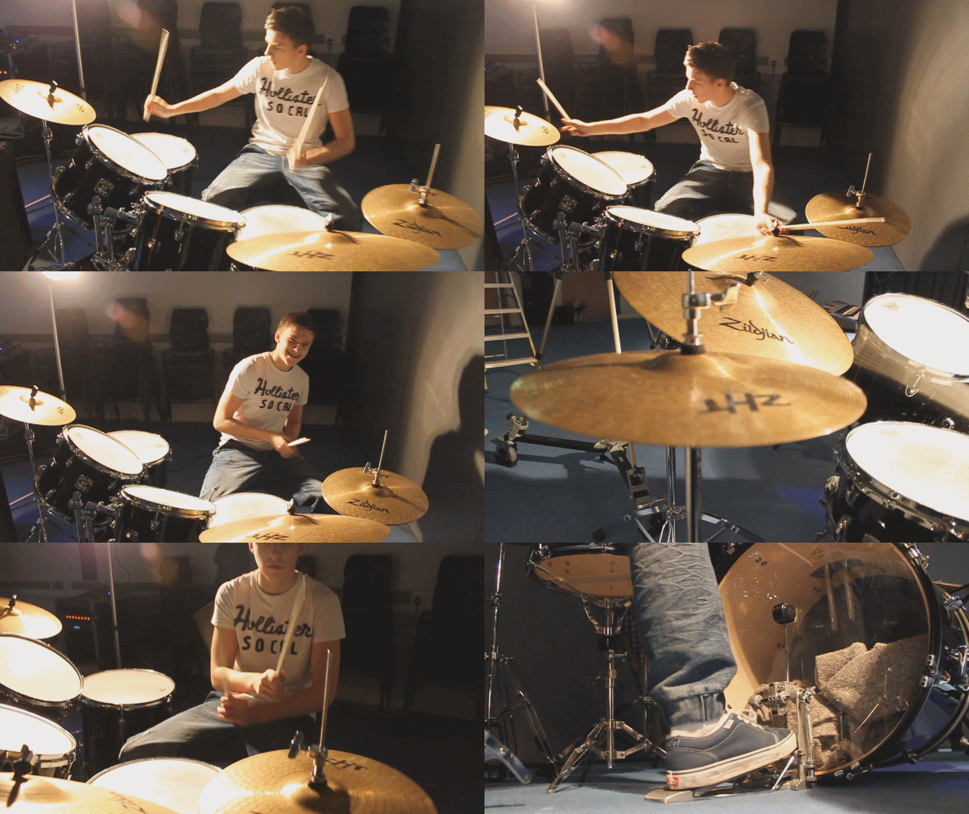
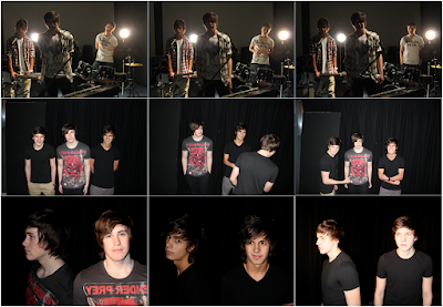
Wednesday, 3 November 2010
Shooting Schedule
I have planned out a few main days which I plan to film but I may re-schedule and add dates to the schedule, if i need to re-shoot. Weather forecasts will be checked daily to ensure i will have the correct chosen atmosphere, as English weather is very unpredictable.
Tuesday 12th October
On this day, I have booked the theatre for the performance scene. I will be there at 3:00pm to stack up all the chairs, to clear the space and I will be getting all of the instruments and other props onto the stage. Props include two amplifiers, two spotlights, two microphones and stands, four rows of chairs, electric guitar, acoustic guitar, tables, full drum kit, and a digital keyboard. The approximate duration of this shoot should be three or four hours, and i have spoken to the school's caretakers and they have told me the school gates lock at 7:00pm on tuesday which should give me enough time to film most of the full band shots, close ups of instruments, and of band members. I have to make sure the lighting system is connected on this day, as sometimes the drama department needs to use the remote elsewhere. The black curtains will be drawn so we wouldn't attract attention from kids outside, and it will be dark inside so I will have to use the Fresnel Lanterns to create a wash of light over the band so it wouldn't be too dark. The spotlights are mainly for the background, to create the stage effect but it can also used as a light source because they are 120 watts each.
Thursday 14th October
This will be one of the narrative sessions, containing shots of the two leads giving the audience a perfect summary of the song, including intimate cuddling, talking on the phone which will be split screened, dramatic arguments, and female lead leaving with packed bags. The location will be at Archie's house as it's only ten minutes away from my college. These scenes are flashbacks so I will alter the settings on the camera, changing the white balance effects so I can saturate the colours later to create an effective look when I edit the videos.
Saturday 16th October
I will wake up at 4:00am on this morning, to film time-lapse videos of the sun rising, to show the adjustments between day and night. It will be filmed on my window sill, with an alarm clock. At 12:00pm, I will meet Archie and Kimberly at school to film some argument scenes and the kiss scene. Similar to thursday, I will adjust camera functions to get my desired desaturated effect.
Thursday 21st October
This will be the second shoot for the performance, same costumes will be required for continuity. Again, I will be getting all of the instruments and other props onto the stage. Props include two amplifiers, two spotlights, two microphones and stands, four rows of chairs, electric guitar, acoustic guitar, tables, full drum kit, and a digital keyboard. Lighting adjustments will be very similar to the first shoot. The duration of this session will be 2 hours because of planned exams the next morning, so the cast will want to go home early as possible to prepare for their tests. After the session, the band members will leave and I will film some scenes with the two leads using the dolly track.
Tuesday 26th October
Today will be the last shoot, as Archie and Kimberly will be very busy after this date so I will not be able to film them anymore, but will have to help them with their video. I will be filming Archie lip syncing in isolated areas which will emphasis his loneliness. These shots are very important as they convey the song's emotion, and will show the audience how he feels lost and regretful. Locations will be Whitechapel,
Tuesday, 26 October 2010
Diary Blog Entry: 261010
I have used the dolly track to film scenes with Archie walking and lip synching in
Monday, 25 October 2010
Diary Blog Entry: 251010
Friday, 22 October 2010
Diary Blog Entry: 161010
Thursday, 21 October 2010
Diary Blog Entry: 211010
Wednesday, 13 October 2010
Diary Blog Entry: 141010
Tuesday, 12 October 2010
Diary Blog Entry: 121010
Monday, 11 October 2010
Diary Blog Entry: 111010
Specific arrangements of props: two amplifiers, electric guitar, acoustic guitar, two microphones and stands, CD player and speakers, rows of chairs, tables, full drum kit, spotlights for tomorrow's filming. Contemplating whether or not to use the dolly track, most probably won't need it for the performance scenes as the tripod can pan and tilt freely already. I called the actors to confirm the "stylish casual" costumes they had to wear. Archie: (lead singer): white shirt, open plaid shirt, jeans, boots, and leather jacket just in case. Larry (guitarist): red plaid shirt, white v-neck, beige skinny jeans and Vans sneakers. Nicholas (drummer): white Hollister t-shirt, navy blue wash jeans, white trainers. I have arranged to collect the equipment at 2:30pm and meet the cast at 3:00pm in the main theatre. I have been in touch with the cast, i have been talking to Nicholas and Larry via Facebook to arrange rehearsal time and have given Archie, the CD and lyrics sheet.
Thursday, 30 September 2010
Casting/Actors
I have been looking for actors/actresses to be in my music video, I originally had my friends outside of college in mind but as they are pretty busy with University and live quite far, it wouldn't be as convenient as if i were to use people that attend my Sixth Form. I had to make sure they had the same free periods as me, and live nearby so we could talk to each other properly, and it'd be easier to plan our schedule. In the end, I went to the Drama Department to find actors/actresses, Kimberly Johnston was very kind and helped me out, she offered to be the female lead so without hesitation, I agreed as she is very talented, and experienced in acting. I have also seen her work in the school Musical last year, and was very impressed. Female role now confirmed, I had to search for the important male lead, but Nicholas Jakubowski who also had a small role in the school musical, had heard I was looking for actors so he asked me if he could be in it. I gave him the lyrics to learn, but he had a lot of trouble lip syncing, as he had a Lithuanian accent. However, he is musically talented so I asked him to be in the video as a drummer and he agreed. I asked Larry, who is in my Graphics class, to play guitar and he was very enthusiastic about the idea of being in a video. Now, I had one lead actress and two band members but it was very difficult to find the male lead, as exams were coming up and everyone wanted to study for them. I asked Archie Leigh, who I was not familiar with until the beginning of this year, and he agreed although he did say he is quite shy, and would need help. We arranged to rehearse and Kimberly taught him a few acting skills, and also taught him how to lip sync properly and after rehearsing for a few hours, Archie seemed confident enough to start filming. I have taken mid-shot photos of my cast on a white background, and produced a brief résumé to make it look more professional.
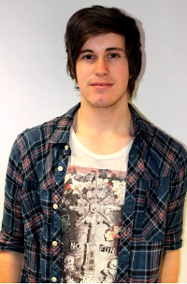
Role: Lead male/singer
Full name: Archie Terry Leigh
Date of birth: 25/08/1993
Eye colour: Blue
Hair colour: Brown
Height: 6"0
Weight: 70kg.
Role: Female lead/Love interest
Full name: Kimberly Johnston
Date of birth: 11/03/1993
Eye colour: Green/Hazel
Hair colour: Light brown
Height: 5"6
Weight: 52kg.
Planning and Preparation
After searching on Myspace and Youtube for unsigned artists, i haven't been too keen on any song choices. But after buying The Script's new album, just released this month, i felt inspired to work with a track by the band as they are not too famous, yet still produce good music.
Here are my possible song choices and rough ideas i have come up with:
The Script - If You See Kay
the song is chilled, and has a relaxed tempo. the male lead is asking everyone he sees, if they've seen the girl he misses. he wants to find her, putting up "MISSING" posters, and talking to strangers, showing the audience that he has gotten rid of his pride for this girl. she'll be sitting down at the cafe, and once she gets up, he comes to the café asking for her, but keeps getting there a split second too late. i may not use this song because the title is subliminally explicit, and also the storyline could drag on and get pretty boring.
The Script - Before The Worst
this is one of my favourite tracks from the album, and i feel it's an excellent choice. i could shoot some performance scenes on a stage, most probably the school theatre or a studio/white room, and narrative will be on location. as he walks around town, he sees places that him and his girlfriend used to be together and reminices. the words "can we take it back, before the worst" will feature rewound footage of the couple arguing and not getting along, back to the good memories of the two together. i think i have the most ideas for this song, so it's likely that i will decide on this track.
The Script - Nothing
a simple straightforward narrative. song starts off as the lead singer talks about his friends taking him to the pub to get some drinks, because he misses a girl and they want him to forget about her. has a night time feel to the song, will shoot the main scene during the evening, with faded night lights in the background. plus performance footage. i feel this song would be a good choice.
The Script - For The First Time
this song's narrative is very simple and would be good for the visuals to follow the lyrics, the male singer reminisces about memories and speaks of the couple's state while being seperated. probably will not use this track because the official music video has already been released. the video is very good, and i'll probably use some of the shots for inspiration.
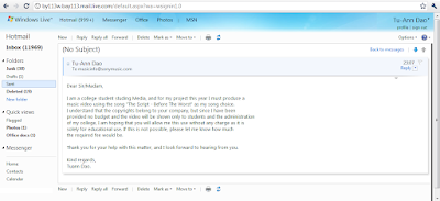
I have written an email to Sony Music Entertainment UK Limited and RCA Records Group, which is a flagship label of Sony Music Entertainment asking to use the song, to confirm that there is no copyright infringement. This is a screen print of the sent email: (please click the image to enlarge.)
After choosing my artist, i thought it'd be useful to look at their previous videos and furthermore, their genre's targeted audience. Their past videos have been both performance and narrative based, which is a conventional aspect in rock pop videos. They aim to portray their moods and feelings through their videos, a technique used to add authenticity.
Deciding on the song, Before The Worst, i have already mentally pictured a variety of scenes for my music video. Locations that would work well with the song can include busy cities, street scenes, homely rooms such as the sitting room and bedroom, as well as "lonely" isolated places such as an empty park, with trees, grass and empty benches. The weather could be damp, rainy, and cold as the guy feels empty without his love. Flashbacks should have a little sunlight, but as sunshine is quite rare in England during these months, i will use the editing software and camera settings to create a more "brighter" scene. Weather forecasts will be checked daily to ensure i will have the correct chosen atmosphere, as English weather is very unpredictable.
Studying the band closely, and listening to all their tracks on both albums, I feel that the targeted audience for my music video should be of mixed gender predominantly aged 16 to 25, reflecting the genre's popularity with teenagers and young adults. This track will most probably be more popular with females, as young male bands tend to attract many female viewers. The mix of the narrative and live performance of the band will be recognisable to the audience as they are familiar with other videos of the same genre. Costumes will be casual yet stylish, such as straightcut/skinny jeans and fitted jackets, allowing the band to appeal to a broad audience. If I were to condone this mise-en-scene feature, the video will only appeal to an audience which has similar interests. The song is about heartbreak which is a typical situation that teens get caught up in, so it will attract a wide audience, as they listen to him speak of his despair, which they can relate to and not feel alone.
__________________________________________________________
Early ideas for specific visuals to lyrics: As he walks out of his house, almost everything reminds him of her, and as he says "it's been about a week since the day that you walked" he remembers, (flashback to be edited: lowered saturation, colour hue, a slight Gaussian blur or bloom, and lighter vignette will help create this look) her walking out and slamming the door. The words "take it back to the night we kissed" will again flashback a scene where the two are flirting, and drinking outside a pub. Flashes back to the present will be the main lead singing while walking and reflecting. Split screen with the female lead lying in bed on the phone while the guy is in the same position when the words "there was a time that we'd stay up all night, best friends yeah talking 'til the daylight" are said, it will be a typical movie scene type of shot. Stage scene with band performance will begin from the first chorus, and different angles will be used to portray the whole band in a positive light, with a few close ups of each band member and also, theatre's lighting will be used, so i'll need someone to control lights. Rewound scenes, used after the second verse/chorus to emphasise the words "before the worst" and it also explains his thoughts on how he wants to go back in time, back to the good memories he had with the girl.
I have been keeping in touch with the cast via facebook and cellphones, and planning rehearsal time. Shooting will start on the week beginning 12th of October 2010 until the end of half term, using a Digital SLR; Canon EOS 550D/Rebel T2i, in full 1080HD and will be edited in Apple's Final Cut Express and Adobe After Effects. I have spoken to Mr. Hutchinson about booking the theatre and props and equipment such as instruments (acoustic guitar, electric guitar, keyboard, full drum kit) and microphones, and he has also arranged to teach me how to use the lighting. (please click image to enlarge, and then click again, zoom to full size)
__________________________________________________________
I have taken photos of potential locations, that I may use for my music video's narrative. I have decided that the scene should not be too crowded, to reflect the lead singer's "empty" world without his love, and it will emphasise his loneliness. The weather conditions, and the season change is very effective as summer is seen as the "happy" stage, and it seems like it started to get colder when the female lead left. During this change, the leaves on the floor and the lower temperature can be adjusted to be visible on the camera. There was a problem with Blogger's site and my images' file sizes were too large to be uploaded, so I used Adobe Photoshop CS5 to create a montage of my photos, and this way, it's much more convenient to view all at once, as there are quite a few. All photos are original and taken by me, on a digital single-lens reflex camera around London (Walthamstow, Leyton, Stratford, Westferry, Shadwell, Canary Wharf, Isle of Dogs, Bow, Wapping).
(please click image to enlarge, and then click again, zoom to full size)
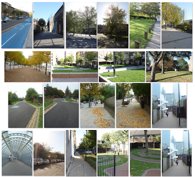
__________________________________________________________
This is the animatic storyboard which will give me a base plan and the audience a rough idea of the scenes. I drew on paper, (approximately 50 different sketches) and then filmed on the school's camcorder for roughly 10 seconds each allowing space and tolerance during editing. I used the tripod so the image will be stable and precise, I have then imported the clips into iMovie, thus allowing me to edit how long every shot will be, and also adding the MP3 file in sync with the video. This storyboard is crucial, as it has helped me run through the lyrics, while jotting down ideas I have come up with. I have then uploaded my video on Youtube for convenience, here is the embed link:
EVALUATION OF PLANNING
Andrew Goodwin’s theory identifies a number of key features which make up a music video, one of which is a link between the music and visuals. The lyrics of my chosen song often muses over past memories of the male lead, illustrated in many flashbacks creating the non-linear narrative, which imitates the structure and recall of human memory. Alongside the narrative, my music video will also feature the band playing live in a performance which conforms to the conventions of an alternative rock/pop rock band. Some examples of artists/bands belonging to similar genres as my video include OneRepublic, Lifehouse, Train, and The Fray, all of which have both narrative and performance based videos. Another common aspect of the genre is their costume; the artist/band does not need to spend ridiculous amounts of money on expensive costumes as the sole purpose of the casual yet stylish attire is to attract a broad audience and make them feel like they can relate to the artist, whereas if this area was overlooked, the audience would feel they are on a completely different level and cannot feel close to them. There will be many close up shots of the main artist, to show his sincere expression and regret that he and his love interest have broken up. There will be no references to voyeurism or notions of looking, contradicting one of the features of the theory, because my music video may not have many shots of the main artist looking directly at the camera as he is entirely in his own world, pondering and reminiscing about his love interest which will add to the nostalgic feeling of the video. There will also be no intertextual references, as I want the sole focus to be on the band and the characters within the video, rather than distracting the audience and giving them ideas of another type media.
CD Analysis: Kid Cudi
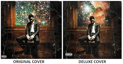
The second studio album by Kid Cudi is a sequel to his first in the “Man on the Moon” series titled “The End of Day” which over 100,000 copies in it’s first week and charted at #4 last year. This is the deluxe edition of the rapper’s “Man on the Moon II: The Legend Of Mr. Rager” which I bought just yesterday when it came out, I usually buy music from iTunes but for I thought I’d buy the Digipak as it can be used to analyse for my media coursework. The cover artwork features him sitting in a Victorian style room, solemnly deep in thought, holding a glass possibly containing Brandy or Whisky which connotes the idea of expensive alcohol is popular with celebrities with such lifestyles. The cover has a faded sepia tint, while the paper looks very creased, the detailing on walls of the room all adds to the 1800s old-fashioned look. The whole package is astronomy themed, in relation to the title of the album “Man On The Moon” implying the idea that he is out of this world; an extraordinary artist. There is a window/painting behind him showing an amazing starry space-like view; interstellar clouds are visible which have become very popular recently, possibly because of this album. The nebula makes the viewer feel relaxed and chilled out, reflecting how Cudi believes his music does, with his original chilled-out slow paced beats. The fold out pack is fairly simple, it features two more images of nebulae with small capitalised and centered text: “my music is one small step for me; one giant leap for all weirdkind” which shows how he believes he is on a different level to everyone else, higher than anyone. “Weirdkind” is American slang for someone who is a leader, and not a follower so this implies that he sees himself as the leader of leaders. He is wearing a clean cut suit which reflects his well-known reputation of being a stylish and an intelligent hip-hop artist, but his top button is undone which suggests he is more laid back. The pack includes lyric booklet with calligraphic fonts, so fans can enjoy singing along; the font is relevant because it suits the Victorian era of the cover and his costume.
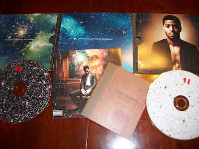
The free poster included with the album is an imitation of Leonardo Da Vinci's famous world-renowned drawing of the 1400s, "The Virtuvian Man" which is based on the human proportions. Kid Cudi may want to relate himself to the work of a famous artist, as he sees wants the audience to see him as a great icon. He also has biblical references with a yellow glow around his head, almost like a halo. Other images of featured artists on the album are also seen within the circle, such as Kanye West, Common, MGMT, and Ratatat. The poster almost looks like a planet, again emphasising that he is out of this world; a great artist, with no other like himself, and the effect on the poster makes it look like a neon painting/sketch which is very interesting to look at.
This is a cover of a metropolitan hipster men's lifestyle magazine which is promoting Kid Cudi's album, which I thought was relevant to include in this section because of the main "out of space" concept being overused to promote Cudi's uniqueness. It is a very interesting cover, as Complex Magazine always uses such images to attract the audience's attention. The image has a surreal theme, and it seems as though Cudi is peeling open the cover to reveal himself and his own world. Constellations and nebulae can be seen from behind the page which is the overall theme of his albums; this is very appealing to the audience because of the rising popularity of these images via the internet (blogging sites, etc.) This cover, poster and CD digipak all have a similar theme and Cudi has created a house style out of it, which concludes the fact that his products must have some type of relation for it to be attractive and appealing to the public.

